

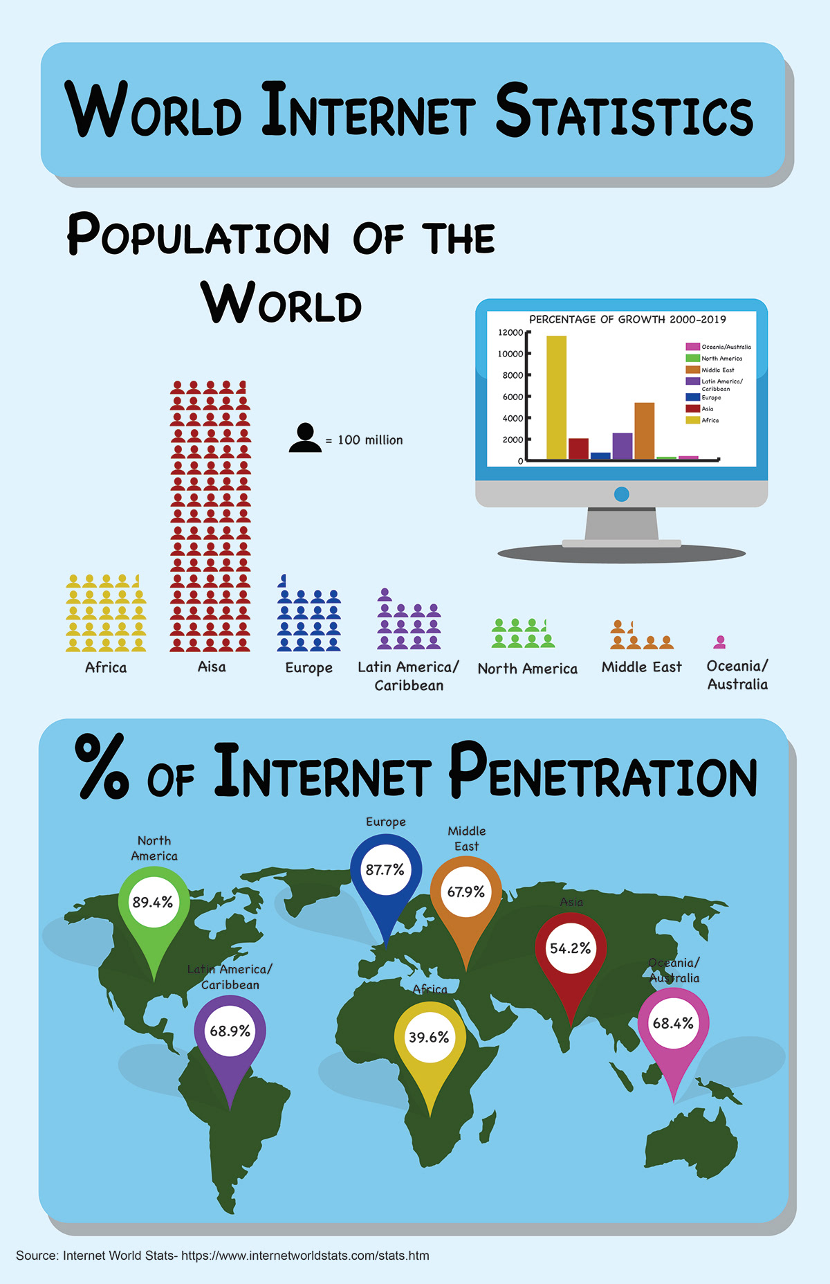

This infographic is statistics on the world’s internet usage and population. It shows the different areas of the world, their population, internet usage growth and internet usage as a whole. The color scheme is supposed to reflect the green and blue of the earth. The different colors of the different areas of the world is meant to contrast against the blue and green and make it so the areas are easily identifiable.


